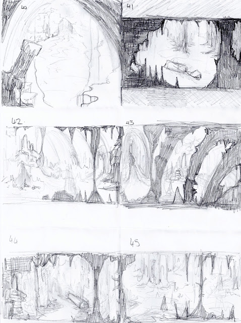
Thumbnails 40-45 were further design ideas for the Cathedral area. trying to work on making the foreground, mid ground and background a little clearer to see.
46 -53 are ideas for the treasure chamber. I have started looking at the details such as what the actual chests might look like, based on how they have been described in the book. Before referring back to the source material, I was drawing the chests like stereotypical chests, or just stone boxes.
I think 51 is the best design so far - i think it is the closest to how it is described in the book, although i've added some small touches to make it stand out a little more.
"Against the wall of this recess were placed three stone chests; each about two feet square. two were fitted with stone lids, the lid of the lid of the third rested against the side of the chest, which was open."
49-53 are some ideas for the chests and ammunition boxes.
An influence map of images i looked at for designing the chests and ammunition boxes, etc in the chamber.
54-57 are some more ideas for the first part of the excerpt, featuring the statues. Trying out different compositions with the giant statues foot.


No comments:
Post a Comment