Monday, 29 October 2012

Space and Environment: Secret Lairs (Amphibian God)


Secret Lair...Amphibian God


                                                   'Amphibian God' suggests some sort of giant monster creature. 


The first ideas that come to mind of how the 'lair' might look, is a damp, dark, sticky cave-like area. The egg room from Alien came to mind.

another idea perhaps is that this is a more graceful creature - so more green, warm forest like surroundings might be his home. 

Here is an influence map of initial ideas for the lair. 


Thursday, 25 October 2012

Creative Partnership

From Nadia
http://nadiayadallee.blogspot.co.uk/


really nice Vikki! I like the way you designed the cave-like elements, the composition and the atmospheric tones fits in well with your overall image, Well done :D on cinematic spaces: final concept - the natural cathedral

Hello vikki :) I really like the composition in this image, the human form compared to the sculptured image of the foot does express proportion and the sense of distance and space very well. In terms of tones colours, it does create a great atmosphere and would look nice with added detail to the mountains in the background in the developmental process. I also reckon adding a bit of mist would compliment the mystery and suspense that this image creates. on Cinematic Spaces: Developed Thumbnail

from jake
http://jakejbryant.blogspot.co.uk/

I agree about the colours. I like how the top image has a spectrum of colour within it and how it creates a nice atmosphere and mood within the environment :) Also in the second image, I think the composition is interesting as the stalactites act as a kind of frame for your image. Also the background lets the mind wander freely about what else exists beyond the aspects that are presented in the image, like how you described the water acting as a 'guide' to the eye :) on Cinematic Spaces: Digital Thumbnails


Hey again Vikki, I just caught this post before I went off, There's 3 more that really stand out to me here; 14 - I like the interesting position the statue is in, and could provide an interesting focal point for your concept. Also, with a foreground element, a nice background and some interesting lighting you could have a strong idea for a final concept. 17 - The way you have drawn this really makes the image stand out to me. I think that it would provide for an interesting foreground element for a painting. 25 - The composition is interesting and has a nice perspective which can make you feel as if you are walking down the passage way behind the huge statues :) on Cinematic Spaces: Drawn Thumbnails 10 - 26

Hey Vikki, Number 9 stands out to me. I like the use of space and I like the positioning of the statues and how there is a kind of 'plinth' in the middle of them. Without knowing much about your scenes, It immediately makes me think of a huge scale of an open room with limited light that has colossal statues towering over the other objects or people with in the space :) on Cinematic Spaces: (Solomon's Mines) Drawn Thumbnails 1-9


Hello Vikki, How is the Space and Environment unit coming along? As you probably know, we are creative partners and we have a green light review on the 11th coming up soon. Part of the criteria for our presentation is to present our active creative partnership. If you have any work to upload post it up (Trying to get others to post their work up as well) so we can all start conversing, or if you'd prefer get together in our group when everyone is available that would be fine too :) on Life Drawing Week 1


from Jebb

These digital thumbnails are great, it is clearly visibles which sketches you have developed, and the colours really illuminate the pictures, appearing almost alien. Excellent work. on Cinematic Spaces: Digital Thumbnails


Numbers #34 and #36 really create the essence of a dark, dank cave system with great composition of foreground and background subjects. on cinematic spaces: drawn thumbnails 34-39

Hey Vikki, You created a great atmosphere to the image, and it is clear you've thought of composition for the image. Great attention to detail, it really gives off a sculptural theme to the object, I feel that the background may need a bit more work to portray mountains, although it works well as clouds. onCinematic Spaces: Developed Thumbnail


Hey Vikki, Great work on the thumbnails, they really give a clear aspect of the scene and the scale of the sculptures. I feel that sketch no. 2 isn't as clear to me as the rest, but no. 5 and 9 clearly portray the sculptures as overpowering, connoting a god like status to the subjects. on Cinematic Spaces: (Solomon's Mines) Drawn Thumbnails 1-9


to Nadia

Hey Nadia, #11 and #13 and my favourites - I like how you have shaped the buildings to appear to be closing in over the viewer. I can see #13 being a good final piece! 
:)

Hi Nadia, your research looks nice and organised here! how are your thumbnails coming along? look forward to seeing your ideas :)

Hi Nadia, 77 - 80 are looking cool! i quite like 77, it makes the room feel dusty and dry, very atmospheric :)

to jake

Hey Jake. I agree with Samantha - This is a very interesting idea, I like the style you have chosen as influence. It'd be cool to see your own style merge with this one. 
:)

hi jake, 
I really like #4, #8 and #11.

#4: I like the the perspective in this one, it makes the viewer feel over powered by this building. 

#8 stands out to me too, i think if you used a similar perspective as in thumbnail 4 on this one, i think this image would make for a good final. 

#11 I also like this one, you could maybe expand on this one to show the surroundings, to show its size in comparison...( http://farm3.static.flickr.com/2278/2524856333_f60877145e.jpg - like this sort of thing?) :)

Hi Jake,

You've a lot of good research here. I can really get a sense of what your book is about. this is reminding me of 'New Eden' from Mirror's Edge - it might be worth looking into some of their concept art :)

http://mirrors-edge.webs.com/img/city10.jpg
hi jake, 
the project is coming along fine, just about to upload some thumbnails and such. admittedly i've not checked into blogger for a while until now. ok, im sure meeting as a group will help with our work, too :) 
anyway, your thumbnails here are looking good so far, it would be good to see some of your thumbnails based on your 'brave new world' extract done using photoshop too :)

Congratulations on finishing your final pieces - concept 2 looks great, i love the art style you have used !

to jebb

Hey Jebb. I like the top image, it gives a very lonely and isolated feel, which works well for a bottom-of-the-ocean setting. With your drawn/digital thumbnails, try to get as many posted as you can, so you can start developing them into your final pieces. :)

hi jebb,
i like #24, i like the idea of light beaming from the distance.
#25 gives a bit of a claustrophobic feel, which i think works well :)

Hi Jebb, 
I like #2 also - I think the colours work very well together too. How are your thumbnails going? :)

Barbarella


Barbarella Review (1968)

figure 1: the poster

From the beginning of the film, Barberella shows clearly not only that it is a product of its time, but aimed firmly at a male audience. Based off of the French Comic strip by Jean-Claude Forest, the film has a very playful ’60’s feel about it. It was released during an age of ‘free love’, where sexual freedom was embraced. This is a film which appears on one hand to be campy, colourful and innocent; however the amount of sexual situations Barbarella (played by Jane Fonda) is put in, makes the film feel unbalanced. It verges on making some scenes feel uncomfortable, simply down to the fact that the target audience is so clearly male, leaving nothing but colours and cute imagery for a female audience. An example would be the opening scene; Barbarella slowly undresses as the credits roll. 
However, there is still something charming about the character of Barbarella. She seems to channel some of Elizabeth Montgomery’s (T.V show Bewitched) mannerisms; particularly that of always being polite, no matter what situation she is in. 
figure 2: Barbarella

The visuals in Barbarella however, are creative and quirky. It has a cheap, makeshift feel throughout, which fits the tone perfectly. "My then husband, Roger Vadim, came up with all these ideas for how to create special effects and no one had ever done it before, so it's kind of fun." (Fonda, 2011)
Many scenes succeed in creating tension, whilst at the same time, keeping the humor intact. Most notably the doll scene during the beginning of the film; although it is in reality a goofy scene, the scene still offers suspense and at the same time, its humor. 


figure 3: flesh eating dolls


The humor in the movie can fall flat, since the jokes are mainly sexual, leaving not much variety, and becoming boring. "Throughout the movie, there is the assumption that just mentioning a thing (sex, politics, religion) makes it funny and that mentioning it in some offensive context....makes it funnier." (Adler, 1968) 

Today, the star Jane Fonda believes that the film is "a charming camp movie, not very sexy."(Fonda, 2011)
Barbarella is filmly a product of its time, which dates the film greatly. It is a film which could be described as marmite; it is either loved, or its hated. 


sources: 

RENATA ADLER http://movies.nytimes.com/movie/review?res=9A01E1DA1530E034BC4A52DFB6678383679EDE&partner=Rotten%20Tomatoes (accessed 

Jane Fonda http://transcripts.cnn.com/TRANSCRIPTS/1112/10/pmt.01.html

images: 

figure 1: http://upload.wikimedia.org/wikipedia/en/thumb/6/61/Barbarella-poster.jpg/215px-Barbarella-poster.jpg

figrure 2: http://www.gavinrothery.com/storage/barbarella_movie_image_jane_fonda__7_.jpg?__SQUARESPACE_CACHEVERSION=1323719762579

figure 3 :http://tikiloungetalk.com/wp-content/uploads/2009/11/barbarella-dolls.jpg


Unit 1 final presentation


cinematic spaces: final concept - solomons treasure chamber


cinematic spaces: final concept - the place of death


Alien Review


ALIEN REVIEW


 figure 1: a discovery


When looking at the synopsis alone, alien comes across as nothing more than an alien version of ‘The Creature from the Black Lagoon’.  However, many things about the film set it apart from others of its genre. A fleshed out story and mythos, acting and unique art design - with artist H R Giger providing set and creature designs based off of his grotesque style artwork, are some of what makes Alien a memorable and influential film.

‘In space, no one can hear you scream’


The plot of Alien is simple: Set in the not too distant future, a small crew of a cargo spaceship receive a warning message from a nearby planet. During their investigation, the  resident alien life form gets on-board their ship. when the crew leave, they are unwittingly trapped with it  on board their own ship. With the exception of Ripley, the main protagonist, the crew are then killed off in a typical slasher-movie fashion. 

What we are treated to along the way, is an investigation into a  strange new planet with its “with the organic innards of the derelict ship and its ghostly egg chambers” (newman 2011) designed by HR Giger , and like the crew, confined on board the spaceship, tensely waiting for the next victim to become the aliens next dinner.

I feel The actors, led by the strong female character of Ellen Ripley (Sigorney Weaver) react realistically to what happens to them and this  helps make the film experience very dramatic and suspenseful. For example, the scene around the dinner table, John hurt’s character begins to experience symptoms prior to  the scene when the alien famously bursts through his chest . in this scene the remaining crew are shown discussing what to do when they assume he is  having a fit. they talk over one another as people do in a panic situation, and then decide the should try to stop him from swallowing his tongue. When the alien  does burst through his chest, apart from the words 'oh god’, the crew just stands in stunned silence.  Screaming is rare in this movie. I think the camera work in the film also helps to create this sense of naturalism by resting on one single shot to let the actors simply have a conversation. 

figure 2: Ellen Ripley, the lead

 The careful pacing of the film is helped by the  limited visual presence of a single entity.
the film keeps the audience enticed by limiting the amount of exposure we have with the , which main reptilian alien form, which Hoffman described “an acid-bleeding, razor-toothed, overgrown cockroach with an ugly practice of gestating its offspring in human hosts.” (Hochman, 1998)
We see the alien species through its life cycle of forms, beginning with the eggs while on the planet, the ‘facehugger’, and finally,  the fully developed alien form.


According to Roger Ebert, "Because it doesn't play by any rules of appearance or behavior, it [the alien] becomes an amorphous menace, haunting the ship with the specter of shape-shifting evil".(Ebert 2003)

              “Perfect organism. It’s structural perfection is matched only by its hostility”


figure 3: The Alien

In scenes requiring the alien to be played by an actor, 6’10 Nigerian actor Bolaji Badejo was chosen to play the part. Test footage for the movement of the alien shows a single camera shot as Badejo moves around the space.  It would have been good to see more shots like that in the film, however this would take away from the mystery of what the alien looks like: up until the last scene in the film, the alien could be any size, any height, and is always kept in the shadows, which is what makes this monster so frightening.  

Despite being released in 1979, making it 33 years old, the films use of strong characters (especially a strong female lead), creative practical effects and an engaging storyline, Alien has remained to this day to be one of the top horror films made to date. 


Sources

David Hochman http://www.hrgiger-webstore.com/ (accessed 25/10/2012)


Kim Newman

images: 


101 thumbnails

Just putting the thumbnails all in one post.


Life drawing 23/10/12


Tuesday, 23 October 2012

cinematic spaces: final concept - the natural cathedral

My final piece for concept #2: the cathedral-like cave. 


                                     Below are some thumbnails which show the development:
1
   
2
3
 4
5
 6
 7
 8
 9
 10


Monday, 22 October 2012

Cinematic Spaces: King Kong Review


King Kong Film Review


Figure 1: the movie poster


King kong (1933) is a Monster movie, with a twist: A love story, between a woman and giant, god-like ape. The film explores the idea of seeing a giant, destructive monster, and realizing that it is simply an animal, with instincts many of which are animalistic, but many also human.

    “Oh no, it wasn't the airplanes. It was beauty killed the beast.”

The film was directed by Meridan C Cooper, and Ernest B Schoedsak; who also developed the original concept. 
What Kong has contributed most to the film world, is not the groundbreaking effects.    The idea was greenlighted based on a test sequence showcasing animator Willis H. O’Brien’s stop-motion models.1


“Ladies and gentlemen, look at Kong, the Eighth Wonder of the World.”


The special effects team worked hard to come up with creative ways to make Kong seem to be a real creature before us. Stop motion models were used, green screen effects were used, sometimes giant Kong puppets were built. 

Most likely down to the stop motion animation, in some animated shots, Kong appears to move in a very animalistic way; the focus can to be on the creatures’ movements and mannerisms, rather than focusing on creating realistic and flowing motion.  Scenes such as the dinosaurs attempting to grab their prey in trees, and under logs, are good examples of this. We can see them acting as an animal would; with no emotion behind them. "A curiously touching fable in which the beast is seen, not as a monster of destruction, but as a creature that in its own way wants to do the right thing. "(Ebert, 2002)

However, since O’Brien had the task of making Kong able to have humanistic characteristics, the realistic animal illusion was sometimes lost. "For example, in King KongKong walks more like a man than a gorilla, and his facial expressions are far beyond what is “normal” for a gorilla." (Pullins, 2003) 


Figure 2: A dinosaur hunts its prey


“Don't be alarmed, ladies and gentlemen. Those chains are made of chrome steel.”

Kong’s original cut included many scenes seen as too violent to be included. Such scenes included one in which Kong shakes the sailors off of a log and into a deadly giant spider pit. This scene has only been seen once by the public, and has been recreated by Peter Jackson since.1


King Kong has remained a popular Hollywood style monster movie, and has been imitated "in films such as Nabonga, Mighty Joe Young, Congo, and even Jurassic Park"(Pullins, 2003). It has also been adapted numerous times; into an animated film, comic strips, television adaptations, and has even appeared in films alongside Godzilla. The most recent adaptation by Peter Jackson, 2005,  has been the closest version to be just as good as the original.


Figure 3: On the empire state building


Sources


 Accessed on 22/10/12
Accessed on 22/10/12

Images

Figure 3

Cinematic Spaces: Research into source material (King Solomon's Mines)


Cinematic Spaces: Drawn Thumbnails 40-57

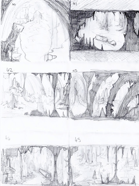
 Thumbnails 40-45 were further design ideas for the Cathedral area. trying to work on making the foreground, mid ground and background a little clearer to see. 


46 -53 are ideas for the treasure chamber. I have started looking at the details such as what the actual chests might look like, based on how they have been described in the book. Before referring back to the  source material, I was drawing the chests like stereotypical chests, or just stone boxes. 

I think 51 is the best design so far - i think it is the closest to how it is described in the book, although i've added some small touches to make it stand out a little more. 

"Against the wall of this recess were placed three stone chests; each about two feet square. two were fitted with stone lids, the lid of the lid of the third rested against the side of the chest, which was open."


49-53 are some ideas for the chests and ammunition boxes.

An influence map of images i looked at for designing the chests and ammunition boxes, etc in the chamber.


54-57 are some more ideas for the first part of the excerpt, featuring the statues. Trying out different compositions with the giant statues foot.


Sunday, 21 October 2012

Cimematic spaces: More thumbnails


A couple more thumbnails..
I think the bottom image could work...perhaps a little symmetrical, although I like the idea of a long tunnel-like space. 


Saturday, 20 October 2012

A developed thumbnail


A developed thumbnail for my third piece.
used a couple of textures, overlayed them, and tried to keep the foreground darker than what i have been doing.

digital Thumbnails


Some thumbnails which i did a couple of weeks ago, where i have tried out a different method of painting, as shown by Phil in the photoshop lessons a couple of lessons ago. Here i had a different idea in mind of what my first piece would be, so i had tried out a few different compositions but with a similar idea. Looking at these again, i quite like #1,  so i might have a go at developing this one a little, to see if it works better than my current final idea (below).


1

2
 

3

4


Thursday, 18 October 2012

Cinematic Spaces: Digital Thumbnails


A couple more paintings, of the 'Catherdral built by nature.' i thought the colours worked well in the top image, although it seems a little cramped and not very spacious in this one. I might make the centre tunnel bigger, and more detailed.


This image is a bit rougher and id found that the rock shapes i was drawing looked a little too big, although i thought the water appeared to guide the eye into the distance in this one, which i thought worked quite well. So i may come back to this one.